When it comes to your brand strategy, no detail is too small. Even our font helps get key messages about Sparx Publishing Group across, including who we are, what inspires us, and what we think the future holds. Keep reading to learn more about our typeface, Proxima Nova, and how it reflects our anything-is-possible brand and values.
/5 mins/ SparxTeam
The Relationship Between Type and Branding
As typographer and designer Doyald Young points out, a business’s journey into typeface begins with this basic push-pull scenario: “Every company truly wants to appear unique…yet they also want to fit within a certain group of taste.”
In short, a typeface can help determine how you stand out – but also where you fit in.
This is why we thought about our audience when selecting a typeface as part of our brand strategy. Will the font appeal to the type of people we’re trying to reach? And if so, is it also unique enough to differentiate us from our competitors?
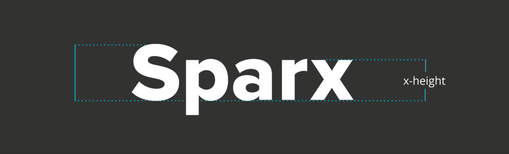
But even before brand strategy comes into play, a typeface has a very basic function: to be read. For that reason, legibility is key.
Legibility refers to the reader’s ability to distinguish one character from another, and is determined by a few different aspects. Legible fonts are “transparent” to the reader, which means they don’t call too much attention to themselves or interfere with the message. They also have “big features,” which include things like a large x-height and easily recognizable character shapes.
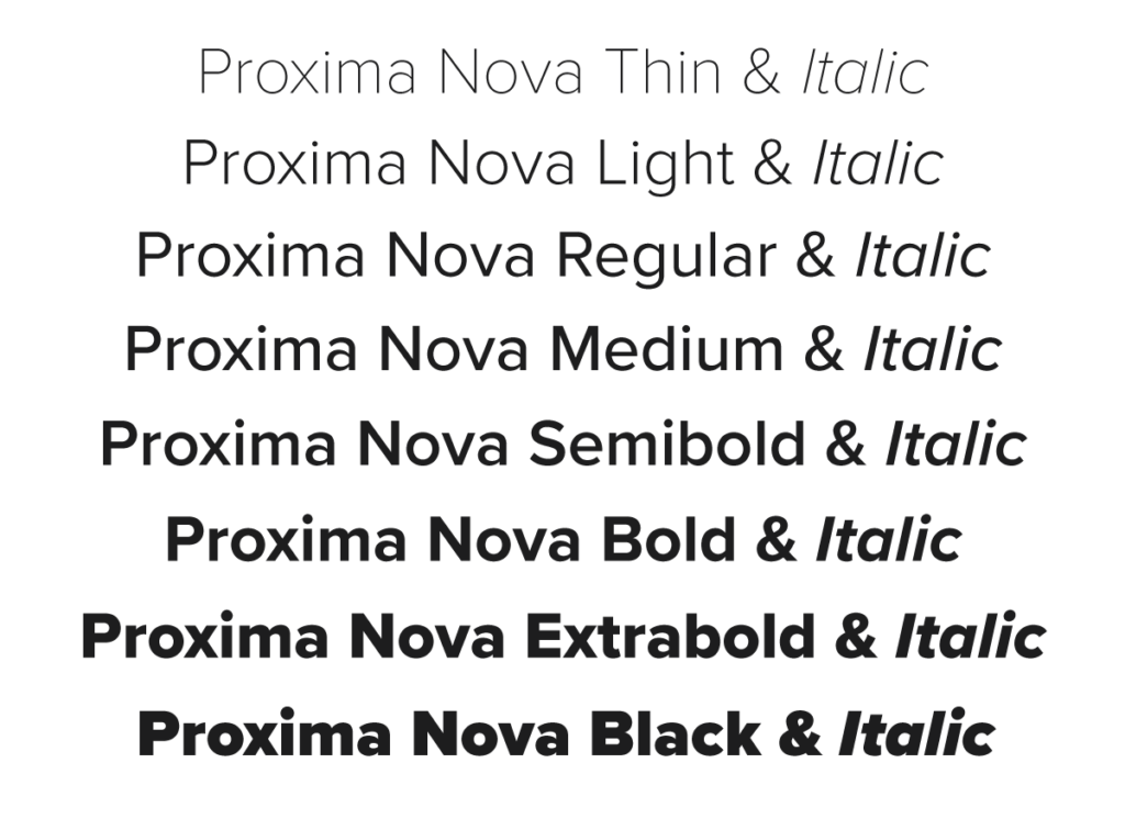
Accessibility is an important consideration, too. For websites or online content, a highly legible font that will render correctly on most computers is preferable. Flexibility in font types and weights – like bold, italic and thin – gives designers a varied palette. This flexibility can be used to easily create a visual messaging hierarchy, ensuring readers see and absorb the most important message first.
Proxima Nova and Retrofuturism
To better understand why Sparx chose Proxima Nova, we sat down with Liz Choi, our Communications Designer. She explained that both she and the President of Sparx Publishing Group, Hamish Khamisa, wanted a look that was futuristic yet retro. She describes it as “modern, but…punchy, bold, and vintage at the same time.”
As it happens, there’s already a name for this kind of aesthetic: retrofuturism. Liz describes it as how “the future would look like in a very imaginative, fantasy-like way.”
The Jetsons, Star Wars, and Guardians of the Galaxy are good examples, not only because they share the retrofuturistic look, but also, as Liz explains, because they “are all fiction, and anything is possible when you’re creating fiction.”
Why Retrofuturism Works for the Sparx Brand
The anything-is-possible aesthetic of retrofuturism is perfectly suited to Sparx Publishing Group’s anything-is-possible brand and values.
Proxima Nova’s modern look helps convey the company’s progressive and future-focused culture, sense of humour, playful creativity, and lighthearted approach. And the unique styling of this typeface helps us differentiate our brand as something interesting and special.
The futuristic element of the font’s aesthetic is a nod to the spark of inspiration – turning imagination and dreams into reality, and creating a future that’s better in every way. This ties directly into the Sparx mission to make the world better. We strive to be the agents of positive change, nurturing small ideas that grow into global ideas. After all, anything is possible in the future!
Proxima Nova’s vintage feel also helps us create a connection with our audience of future-focused thinkers.
Most of us recognize shows like Star Trek and The Jetsons, which portrayed an idealistic view of the future. These shows were a product of their time, and the creative choices around what a futuristic world would look like were heavily influenced by what people were familiar with in their time.
Today, the news has increasingly more examples of that idealistic future being brought into commercial reality, with companies like SpaceX reigniting the idea of extraterrestrial adventure in the collective imagination. In short, choosing Proxima Nova reflects our commitment to dreaming about what’s possible in the future even though we’re using the tools of today.
Finally, Proxima Nova is a more distinguished choice than, say, an open source font. Intentionally selecting something special doesn’t just fit our branding aesthetic, it’s also a public statement of the professionalism we put into our client work.
Proxima Nova: Cool Trivia and History
Proxima Nova was released in 2005. But type designer Mark Simonson actually started working on the typeface almost 25 years earlier in 1980! In 1994, an early version called Proxima Sans was released. (In case you were wondering, “proxima nova” means the “new next” in Portuguese.)
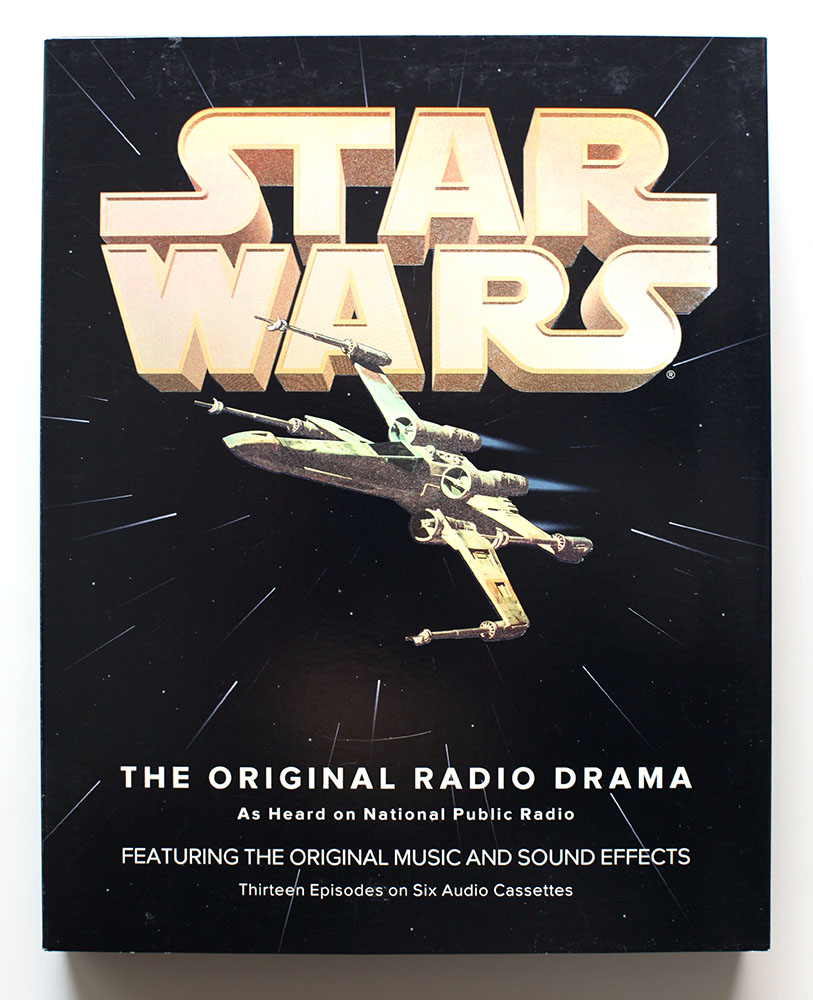
But even before that, in 1993, an early version of Proxima Nova had an out-of-this-galaxy debut. At that time, Simonson was calling the unfinished font Visigothic, and decided to try it out on a packaging project he was working on: Star Wars: The Original Radio Drama. Fun fact: The Empire Strikes Back was released in 1980, the same year that Proxima Nova was first conceived of.
Simonson says that “it felt a little weird using my unfinished type design for the project, but it seemed to work. I showed it to the other people I was working with and they thought so, too. So I used it.” That adventurous leap of faith ended up being the first public use of what would become Proxima Nova. Talk about a star-studded premiere!
In 2005, another famous piece of retrofuturism premiered: the film version of War of the Worlds, starring Tom Cruise. This classic science fiction work by H.G. Wells was first published in 1897, but is best known for its release as a radio drama in 1938, which allegedly caused listeners to panic when they tuned in and mistakenly thought the alien invasion was real.
Of course, we didn’t know all this when we initially chose Proxima Nova, but clearly the futuristic feel of the font is something others see too. The more we learned about its application, the more we were convinced that this font was just our type!
Look to Your Branding Future
If you’re looking to the future of your business and need help with brand strategy, creating great content, marketing your business, or if you simply have questions, the experts at Sparx Publishing Group are always available to chat. You can reach us here.
Climate change doesn’t stop at the border, so neither should climate action. PNW Climate Week brings the Pacific Northwest region together for a week of community-led events—open and accessible for anyone to host and attend—to turn awareness into action.
Looking to attend purpose-driven events? Sparx has compiled a list of networking and learning opportunities taking place in July, August, and September.
The implementation of circular economy solutions at scale requires standardized rules for infrastructure and product design. In this special conversation featured in Circular Economy Magazine, Danielle Holly, Executive Lead, North America of the Ellen MacArthur Foundation, shares exclusive insights garnered from the Foundation’s extensive work as a convenor and trusted voice in the circular economy space.